


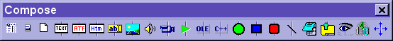
Compose toolbar can be used to add components to your elements (e.g. texts, pictures, sounds, video, etc.). This toolbar can be found on the main docking toolbar (if visible) or displayed with Window : Toolbars : Compose on the main menu (you must choose File : Level : Middle or Professional for the Window item to be available on the main menu):
An alternative way of adding components to your elements is to choose options from Edit : Add components menu. You can also paste texts or pictures directly from the clipboard (e.g. with Shift+Ins). In such a case, SuperMemo will create new components for you.
To automate changes to the looks of many elements at the same time, read about templates.
Here is the use of individual buttons:
- Pop-up menu buttons - open pop-up menus
otherwise available with right-click over the element display area and over individual
components
- Element pop-up - open the element pop-up menu with operations pertaining to the currently displayed element
- Component pop-up - open the current component pop-up menu with operations pertaining to the current component's type
- View source button - show the source data of the displayed element (i.e. the appearance of the element before a template has been applied). If no template is used with the displayed element, this button has no effect
- Component buttons - create different
component types (see below):
- Text component - this button can be used to create simple text components. To create a text component (1) click on the text component button, (2) click on the element area at the desired location of the top-left corner of the created component, and (3) click at the location of the bottom-right corner of the created component
- Rich text component (RTF component) - more advanced text components with different fonts, colors and formatting (those components require much more disk space and should only be used if you need to apply different fonts and formatting in text). Rich text components are by default used in reading options as well as when pasting text from the clipboard (in case there is no component to paste the text to)
- HTML component - web browser components displaying HTML texts, formatting, images, frames, tables, scripts (e.g. JavaScript), etc.
- Spell-Pad component - text components that allow of text input and evaluation (e.g. for spelling exercises)
- Image component - picture components (you case paste images from the clipboard for use with the image component)
- Sound component - sound components that play WAV, MP3, MIDI and other sound file formats
- Video component - AVI or MPEG video components
- Script component - SuperMemo script components that add life to your SuperMemo collections (e.g. by moving components, providing drag-and-drop exercises, point-and-click exercises, hiding and displaying components, playing sounds or other scripts, etc.). See: Using scripts in SuperMemo
- OLE component - for displaying and editing objects created with other applications (such as Word documents, Excel spread-sheets, Mind Manager mind-maps, Corel pictures, equations, structured formulas, and many more)
- Program component - for enhancing SuperMemo with external programs and DLLs. You can import simple programs to run from within your collection (e.g. you can import C:\winnt\system32\CALC.EXE to run a calculator from within your collection)
- Ellipse component - ellipse shape components
- Rectangle component - rectangle shape components
- Rounded rectangle component - rounded rectangle shape components
- Line component - line components
- Component display mode buttons - change the
way the components are displayed and acted upon:
- Editing mode button - set all components in the mode that makes it possible to edit texts, edit OLE objects, etc.
- Dragging mode button - set all components in the mode that makes both dragging and sizing possible
- Presentation mode button - set all components in way they will be seen by the student during repetitions
- Component tags button - display component numbers, types and names
- Alignment and size button - make it possible to size and align all components that are currently in the editing or dragging modes
All component buttons listed above make it possible to add new components to the element display area.
To add a new component you need three mouse clicks:
- on the button corresponding to the component type (on the Compose toolbar)
- on the top-left corner of the area where the component is to be placed (within the element window)
- on the bottom-right corner of the component area
For example:
- to create a simple text component: click the text button, click two points over the element display area, and type in the text
- to create an image component, copy the image to the clipboard and choose Shift+Ins to paste the image (if there are not image components to paste the image, the image component will automatically be created). Drag the image to the right location
- to create a simple sound component: click the sound button on the Compose toolbar, click two points over the element, right-click the newly created image rectangle, choose Import file on the sound component pop-up menu and select an sound file to be played (e.g. mp3 or wav)
- to create a simple video component: click the video button, click two points over the element, right-click the newly created video rectangle, choose Import file on the video component pop-up menu and select a video file to display (e.g. avi or mpeg)
Frequently Asked Questions
(Vaclav, Jun 23, 2001)
Question:
Can sound components convert WAV files to MP3 (as image components convert BMP to
JPG)?
Answer:
No. You need a separate utility to convert WAV files
to MP3